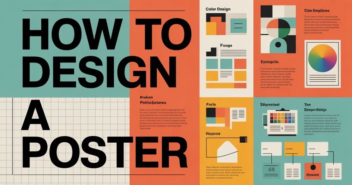

Introduction
Poster design isn’t dead. It evolved.
You’ve seen them those striking posters that stop you mid-scroll or make you pause on the street. They communicate instantly. They persuade without saying much. And they separate designers who get it from those still cluttering layouts with every idea at once.
In 2026, poster graphic design isn’t about cramming information. It’s about visual hierarchy in posters, bold choices, and clarity that cuts through noise. Whether you’re designing event posters for music festivals or creating advertisement poster design for products, the fundamentals haven’t changed but the execution demands more discipline than ever.
This guide walks you through the complete poster design workflow that professionals use. No fluff. Just actionable steps you can apply today.
Why Poster Design Still Matters
Digital platforms dominate. Yet posters remain powerful.
They force constraints. One canvas. Limited space. Every element must earn its place. This pressure builds better designers faster than any other medium.
Film promotions still use them. Social campaigns depend on them. Music festivals can’t launch without them. The medium survived because it works when done right.
Why Poster Design Still Separates Amateurs from Designers
Amateurs add. Professionals subtract.
You’ll see the difference immediately. Amateur posters overflow with fonts, colors, images, and text. Professional work breathes. It uses white space strategically. It guides your eye exactly where it needs to go.
Mastering poster design teaches you composition rules, typography principles, and creative decision-making under constraints. Skills that translate everywhere.
Understanding the Foundation
Before touching any graphic design software, you need clarity.
Step 1: Define Your Purpose Clearly
What’s this poster doing? Promoting an event? Selling a product? Raising awareness for a cause?
Your purpose dictates everything. Event poster design needs date, time, location prominence. Product advertisement poster design prioritizes the product itself. Social campaigns lead with emotion and messaging.
Write down your objective. One sentence. If you can’t articulate it clearly, your audience won’t understand it either.
Step 2: Understand Your Target Audience
Who’s looking at this?
A minimalist poster design for an art gallery attracts different eyes than a vibrant festival poster. Age, interests, aesthetic preferences they all matter.
Your audience determines tone, color choices, and complexity level. Design for them, not yourself.
Step 3: Choose the Right Poster Size
Standard sizes exist for reasons.
Print posters commonly use 18×24 inches, 24×36 inches, or A-series formats (A3, A2, A1). Digital posters for social media require different dimensions: 1080×1350px for Instagram, 1200×628px for Facebook.
Choosing wrong dimensions wastes time later. Decide format first based on distribution method.
The Practical Design Process
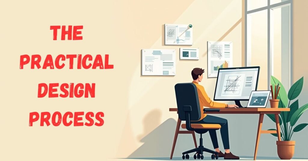
Theory means nothing without execution.
The Practical Poster Workflow That Actually Works
Professional designers follow systems, not inspiration.
- Define objective and audience
- Gather visual references
- Sketch rough layouts (yes, physically)
- Choose typography and color palette
- Build in design software
- Refine hierarchy and spacing
- Test at actual size
- Gather critique
- Finalize and export
This poster design workflow prevents the paralysis of staring at blank canvases.
Layout and Structure
Structure determines success before content enters.
Step 4: Create a Strong Visual Hierarchy
Your eye should follow a path. Intentional. Controlled.
Visual hierarchy in design uses size, color, contrast, and position to guide attention. The most important element dominates. Supporting elements recede.
Supporting Layout Elements
Every poster needs these layers:
- Dominant visual element: One anchor that captures attention first
- Primary headline: Your main message, bold and unmissable
- Secondary information: Supporting details, smaller but readable
- Call to action: What you want viewers doing next
Use Headline as the Focal Point
Headlines carry weight literally.
Choose a display font that demands attention. Make it large. Position it prominently. This isn’t the place for subtlety.
Use Subheading for Supporting Info
Subheadings bridge your headline and details.
They provide context without overwhelming. Keep them concise. Use a supporting font that complements your display choice without competing.
Body Text Should Be Minimal
Less text wins always.
Include only essential information. Cut ruthlessly. Every word you remove strengthens what remains. If it doesn’t serve the purpose, delete it.
Typography and Fonts
Typography separates good posters from forgettable ones.
Typography Is the Real Design
Typography principles matter more than most beginners realize.
Your font choices communicate before anyone reads words. Serif fonts suggest tradition and authority. Sans-serif feels modern and clean. Display fonts create personality but require restraint.
Step 5: Pick the Right Fonts
Start with proven combinations.
Limit Font Choices
Two fonts maximum. Three if absolutely necessary.
More fonts create chaos. One bold typography choice for headlines, one clean option for body text. Done.
Typeface pairing follows simple rules: contrast weights, not styles. Pair a heavy display font with a light sans-serif. Avoid pairing two decorative fonts disaster guaranteed.
Ensure Readability
Readable posters get remembered. Artistic ones get ignored.
Test your font choices for posters at actual viewing distance. If people squint, you failed. Consider kerning and line spacing carefully tight tracking works for headlines, but body text needs breathing room.
| Font Type | Best Use | Common Mistakes |
|---|---|---|
| Display Fonts | Headlines only | Using for body text |
| Sans-Serif | Body text, modern headlines | Overusing geometric sans |
| Serif | Traditional body text | Choosing ornate serifs |
| Script | Accents, special emphasis | Making entire headlines script |
Explore More: How Does EndBugFlow Software Work?
Color Strategy
Colors trigger emotions before conscious thought.
Step 6: Use Colors Strategically
Random color choices scream amateur.
Color theory for posters isn’t complicated. Understand basics: warm colors (red, orange, yellow) energize; cool colors (blue, green, purple) calm. Use psychology intentionally.
Follow the 60-30-10 Rule
Professionals use this formula religiously.
- 60%: Dominant color (usually background)
- 30%: Secondary color (supporting elements)
- 10%: Accent color (call to action, highlights)
This ratio creates design clarity and communication without overwhelming viewers.
Maintain Contrast
Low contrast kills posters faster than anything.
Your text must pop against backgrounds. Dark text on light backgrounds. Light text on dark backgrounds. Test in grayscale if hierarchy disappears, your contrast fails.
Contrast and spacing in design work together. Strong contrast allows tighter spacing. Weak contrast demands more white space.
Images and Visual Elements
Visuals anchor everything else.
Step 7: Use High-Quality Images and Graphics
Pixelated images destroy credibility instantly.
Use high-resolution photos (300 DPI for print, 150 DPI minimum for digital). Source from professional stock sites or shoot original content. Quality shows immediately.
Choose One Clear Focal Image
Single dominant visual element beats multiple competing images.
One striking photo or graphic illustration creates impact. Multiple images create confusion. Choose your anchor carefully it defines your poster’s personality.
Maintain Consistent Style
Mixing illustration styles looks unprofessional.
If you start with minimalist line drawings, stick with that aesthetic throughout. Photorealistic images don’t blend with cartoonish graphics. Design consistency and discipline matter.
Layout Alignment
Alignment separates professionals from everyone else.
Step 8: Use Grid System for Alignment
Grid systems in design aren’t optional. They’re fundamental.
Grids create invisible structure that organizes chaos. Use columns (typically 3-6) to position elements. Align everything to grid lines. Nothing floats randomly.
Alignment in graphic design creates visual cohesion. Left-aligned text feels natural for Western audiences. Centered alignment works for formal designs. Right-aligned text creates tension use sparingly.
Common grid mistakes include:
- Ignoring grid lines entirely
- Creating too many columns
- Aligning some elements while others float
- Using grids but breaking them without purpose
Conversion Element
What happens after someone sees your poster?
Step 9: Add a Clear Call to Action
Every poster needs direction.
“Visit our website.” “Buy tickets now.” “Join the movement.” Whatever action you want, state it clearly. Use effective white space around CTAs to make them stand out.
Position calls to action strategically usually bottom third or right side, following natural eye movement.
Finalization Process
You’re not done when design feels complete.
Step 10: Review and Test Before Finalizing
Print a physical proof. View digital versions on actual devices.
Check these elements:
- Typography: No orphans, widows, or awkward breaks
- Alignment: Everything locks to grid
- Color accuracy: Matches brand guidelines
- Resolution: Crisp at intended size
- Readability: Clear from viewing distance
Gather design critique from others. Fresh eyes catch mistakes you’ve stopped seeing.
Poster Design Formats
Distribution method changes everything.
Digital vs Print Poster Design
Understanding the difference prevents expensive mistakes.
Digital Posters
Screen-based posters prioritize:
- RGB color mode (not CMYK)
- 72-150 DPI resolution
- Optimized file sizes for loading
- Interactive elements when applicable
- Platform-specific dimensions
Canva poster design works beautifully for digital formats. Templates streamline social media sizing.
Print Posters
Physical posters require:
- CMYK color mode
- 300 DPI minimum resolution
- Bleed margins (typically 0.125 inches)
- Pantone colors for brand accuracy
- Paper stock considerations
Adobe Illustrator poster workflows excel here. Vector graphics scale infinitely without quality loss.
Common Poster Design Mistakes
Learn from others’ failures.
Common Poster Design Mistakes to Avoid
These errors plague beginners consistently.
Too Much Text
Overcrowded poster design kills impact faster than anything.
If your poster looks like a newspaper article, you failed. Cut text ruthlessly. Use bullet points sparingly. Trust visuals to communicate.
Poor Contrast
Weak visual hierarchy happens when everything competes equally.
Make bold choices. One element dominates. Others support. Nothing fights for attention.
No Clear Focus
Multiple visual anchors confuse viewers.
One message. One dominant image. One purpose. Simplify.
Ignoring Margins
Bleeding elements to edges without intention looks amateur.
Use margins deliberately. Create breathing room. Don’t suffocate your design by filling every pixel.
Design Tools and Learning
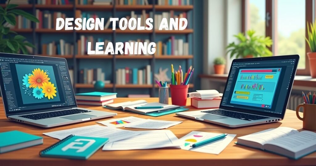
Tools matter less than skills.
Tools You Can Use for Poster Design
Options range from free to professional.
Graphic design software tools worth learning:
| Tool | Cost | Best For | Learning Curve |
|---|---|---|---|
| Canva | Free/Paid | Quick digital posters | Easy |
| Adobe Illustrator | Subscription | Professional print posters | Steep |
| Photoshop | Subscription | Photo-heavy designs | Moderate |
| Figma | Free/Paid | Collaborative digital work | Moderate |
| Inkscape | Free | Vector illustrations | Moderate |
Choosing the Right Design Software Without Wasting Time
Beginners overthink tool selection.
Start with Canva for poster design if you need results fast. Move to Photoshop poster workflow when photo manipulation matters. Learn Adobe Illustrator poster tips for professional print work.
Don’t learn five tools simultaneously. Master one, then expand.
Learning Graphic Design Without Paying for Expensive Courses
Free graphic design resources exist everywhere.
YouTube offers thousands of graphic design tutorials. Websites like Skillshare provide graphic design online courses (often with free trials). Follow designers on social media for beginner graphic design tips.
Practice beats theory every time. Watching tutorials without creating builds nothing.
Using Idea Generators Without Losing Creative Control
AI design inspiration tools help when stuck.
Graphic design ideas generator platforms provide prompts: “Create a minimalist protest poster using only typography” or “Design a fictional jazz festival 1972 poster with vintage aesthetics.”
These creative constraints in design push you forward. But don’t let AI poster idea tools replace original thinking. Use them as starting points, not solutions.
Designer Growth
Skills compound through deliberate practice.
Building a Portfolio That Reflects Real Skill
Your building graphic design portfolio strategy matters enormously.
Include varied work:
- Event poster portfolio pieces
- Typography-focused portfolio designs
- Bold graphic concept showcase projects
- Minimalist layout portfolio examples
Quality trumps quantity. Ten exceptional poster design projects beat fifty mediocre ones.
The Discipline Most Designers Avoid
Consistency builds skills faster than intensity.
Daily design challenges transform amateurs into professionals. Create one poster daily for 30 days. Constraint breeds creativity.
Try these design practice exercises:
- Typography-only travel advertisement posters
- Single-color minimalist poster prompts
- Recreating existing posters you admire
- Designing without photos (type and shapes only)
Reverse engineering posters teaches faster than tutorials. Find professional work you love. Rebuild it exactly. You’ll discover composition techniques you’d miss otherwise.
Where Designers Actually Improve
Real growth happens through feedback.
Seek critique in graphic design communities. Post work. Accept harsh feedback. Iterate based on responses.
Design replication exercises combined with feedback create skill progression in design that courses can’t match.
FAQs
How long does it realistically take to become confident in poster design?
Three to six months of daily poster challenges builds solid foundational confidence. You won’t master every style, but you’ll create effective work consistently. Improving design skills never stops even professionals grow continuously.
Should beginners start with Canva or jump straight into Illustrator?
Start with Canva poster design for immediate results. Learn design clarity and communication first. Once fundamentals click, transition to Adobe Illustrator poster work for professional depth. Tools matter less than understanding poster design fundamentals.
How do I know if my poster layout is balanced?
Flip your design upside down. Does alignment and spacing in design still feel intentional? Use the squint test blur your vision and check if visual hierarchy remains clear. Balanced layouts work from any angle.
Are AI idea generators hurting creativity?
Graphic design ideas generator tools hurt lazy designers. They help thoughtful ones. Use AI poster idea tools for prompts, not finished concepts. Creative decision-making under constraints builds real skills that AI can’t replicate.
What’s the biggest mistake new designers make in posters?
Overcomplicating layouts destroys more posters than any other mistake. Beginners add when they should subtract. Learn effective white space use early. Simplicity communicates. Complexity confuses.
The Takeaway
Poster graphic design remains one of the most effective ways to build core design skills rapidly.
You’ve learned the complete poster design workflow from understanding poster design fundamentals through final execution. You know which graphic design software tools suit different needs. You’ve discovered free graphic design tutorials and resources that replace expensive courses.
The path forward: original poster creation through daily design challenges. Stop consuming endless tutorials. Start creating imperfect work. Seek design critique. Iterate relentlessly.
Remember Gfxdigitational represents the evolution of poster design in 2026. It’s about intentional choices, strategic restraint, and bold typography that communicates instantly. Whether you’re designing for film promotions, music festivals, or social campaigns, these principles apply universally.
Master poster design, and you’ll master visual communication itself.
Now stop reading. Start designing.
Admin of LCF Magazine, a general online magazine covering technology, business, finance, and lifestyle topics. Passionate about sharing informative, easy-to-read content for modern readers.Focused on delivering helpful insights, trends, and practical knowledge online.